thecomponent
thecomponent.co
Welcome to thecomonent's UI kit
It's awesome to have you here! Here is some important information to get started.
About
Framer Sections and Components Kit is designed to help you create sleek, modern websites with remarkable speed. Build complete sites in hours, not weeks, using a powerful collection of components, variants, variables, and responsive sections. Use color and typography systems, transforming basic black, white, and grey sections into visually striking, fully-styled websites.
Creator of the kit

Justin Sinkevicius
How it works
I highly recommend duplicating this Framer file before starting any new website project. This ensures you always retain the original, unedited version. For each new site, simply copy and paste the relevant sections to newly created page, customize components, and assign your desired colors and typography. Once you've completed the design, remove any unnecessary pages or sections. It’s a simple, efficient workflow that keeps your source file intact while allowing flexibility for new projects.
Updates
We will regularly update the kit with new sections, components, categories, and eventually full templates and pages. You’ll receive an email with the information along with the updated remix file of the kit.
Sections
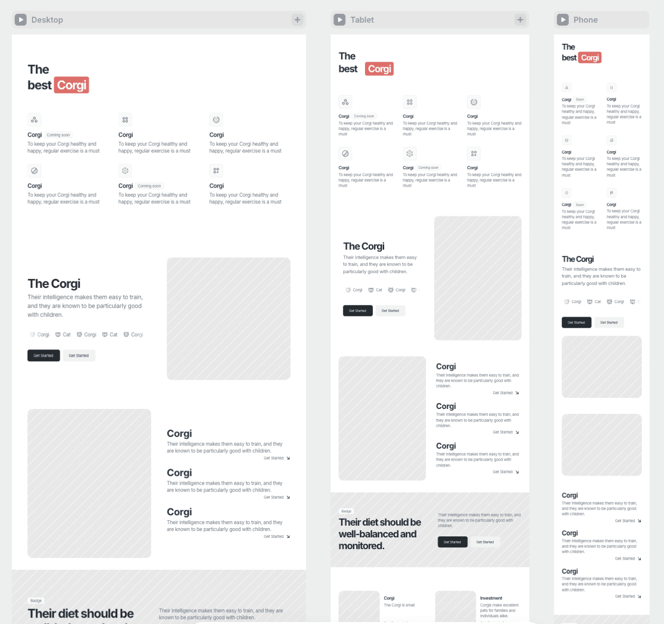
All sections are clean, versatile, and designed with three responsive breakpoints. You can seamlessly copy and paste these sections into other pages or projects. To ensure proper responsiveness, be sure to add all three breakpoints from your side before copying. This guarantees flawless adaptation across different screen sizes.

Style system
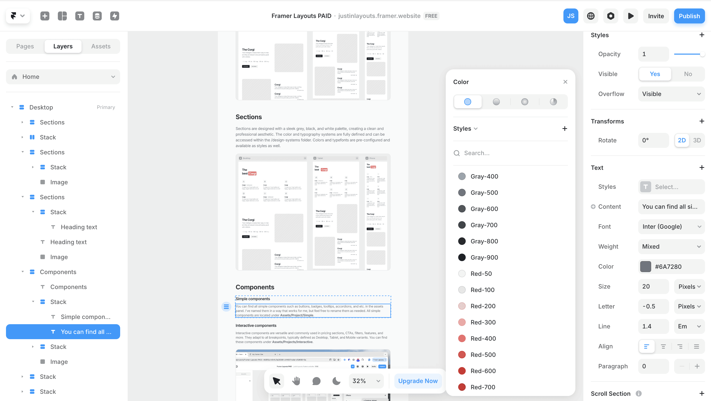
Sections are designed with a sleek grey, black, and white palette mostly, creating a clean and professional aesthetic. The color and typography systems are fully defined and can be accessed within the /style-system folder. Colors and typefonts are pre-configured and available as styles as well. Feel free to adjust them to your needs.

Components
Simple components
You can find all simple components such as buttons, badges, tooltips, accordions, and etc. in the assets panel. I've named them in a way that works for me, but feel free to rename them as needed. All simple components are located under Assets/Project/Simple.
Interactive components
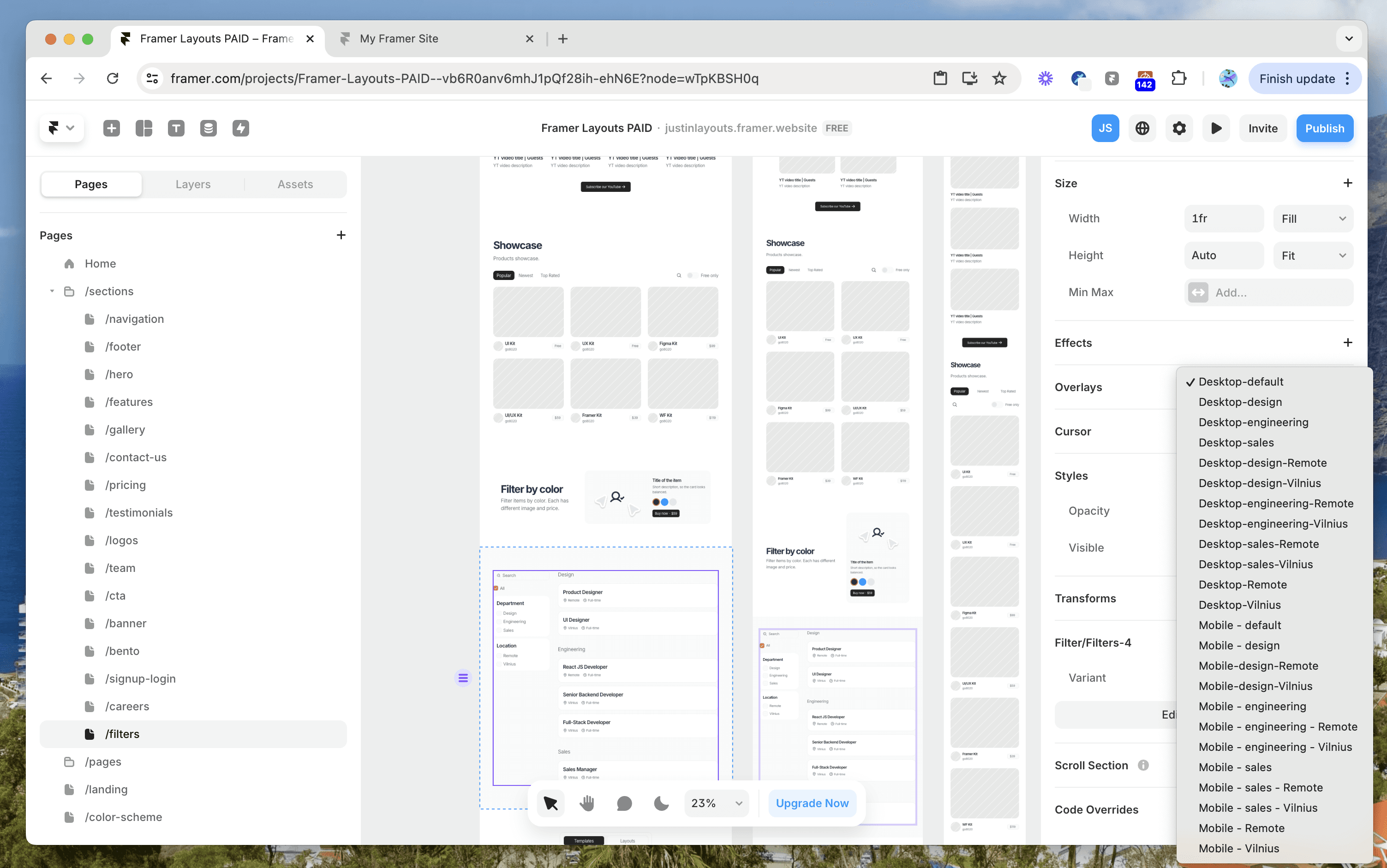
Interactive components are versatile and commonly used in pricing sections, CTAs, filters, features, and more. They adapt to all breakpoints, typically defined as Desktop, Tablet, and Mobile variants. You can find these components under Assets/Projects/Interactive.

Variants and variables
Many components come with variants and variables. If you're unfamiliar with these, feel free to reach out via email for assistance. If you're comfortable with them, feel free to edit and adapt as needed. You may also need to add new variants or variables to some components in some cases.
Feedback & Requests
We encourage you to report any bugs or send us a virtual high-five if you're enjoying the kit. If you have suggestions for sections, components, or pages you'd like to see, feel free to email us. We'll review them and potentially include them in a future update.
Support
if you are having trouble with this kit, shoot us an email, we'll try to get back to you as soon as possible. We are here to help you out!
hello@thecomponent.co
Happy building!
Kit designed and built in LT🇱🇹
thecomponent
thecomponent.co